Overview
Team
Me (UI designer / UX designer), UX Researcher, Visual Designer, PM
Date
Jan, 2020 - Sep, 2021 / 7 months
Category
Mobile Design
Tools

Skills
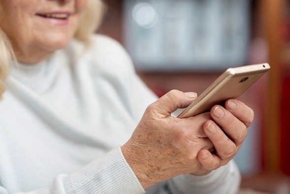
Imagine this: you're an elderly person living alone, trying to keep track of multiple medications each day. Some are taken with breakfast, others with dinner, and all have complicated names that are hard to remember. On top of that, your eyesight isn’t as sharp as it used to be, and most apps feel like they’re designed for tech-savvy youngsters. Frustrating, right?
This is the reality for many seniors in Canada. About 70% of people over 60 live alone, and nearly 90% rely on daily medications to stay healthy. But memory issues and confusing digital tools make it easy to forget important doses, leading to serious health risks.
Solution
Our team set out to design a pill reminder app with a simple, accessible interface tailored specifically to seniors. The goal was clear: minimize frustration, prioritize ease of use, and create an experience that genuinely improved users' lives.
01/
How Did We Uncover the Real Needs of Elderly Users?
Competitive Research: We created a detailed table analyzing similar apps, documenting their strengths, weaknesses, ratings, and user feedback. This analysis shed light on glaring gaps—poor visual design, lack of feedback, and confusing navigation.
Field Studies: To understand seniors better, we immersed ourselves in their experiences. We researched their daily routines, online behaviors, and accessibility needs. We also studied a key resource, the NN Group’s article "UX Design for Seniors (Ages 65 and older)," which provided valuable insights into the specific difficulties seniors face with technology.
Key Insights
· Medications are often tied to meals, so timing should reflect this.
· Users frequently forget dosage details, requiring reminders for quantities.
· Navigation is critical—getting lost in the app frustrates and alienates users.
· Most seniors follow a structured daily routine, with even their meals scheduled at specific times.
If i can use the product easily, I will not even write down the time of the medicine
a 73 years old user
02/
From Findings to Functionality: Defining Key Features
Brainstorming with FigJam: Our team—designers, marketers, stakeholders, and developers—collaborated in a dynamic online session.
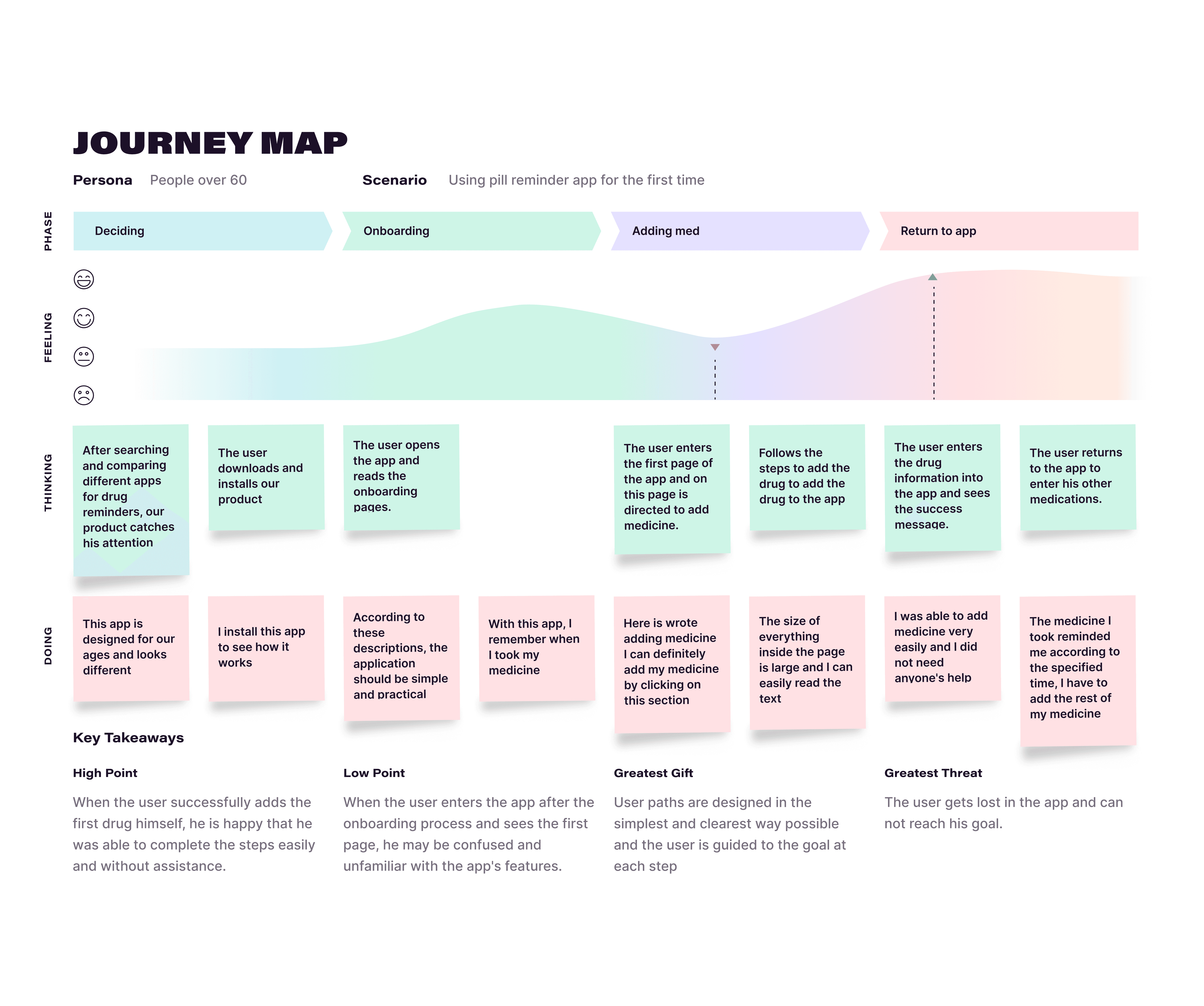
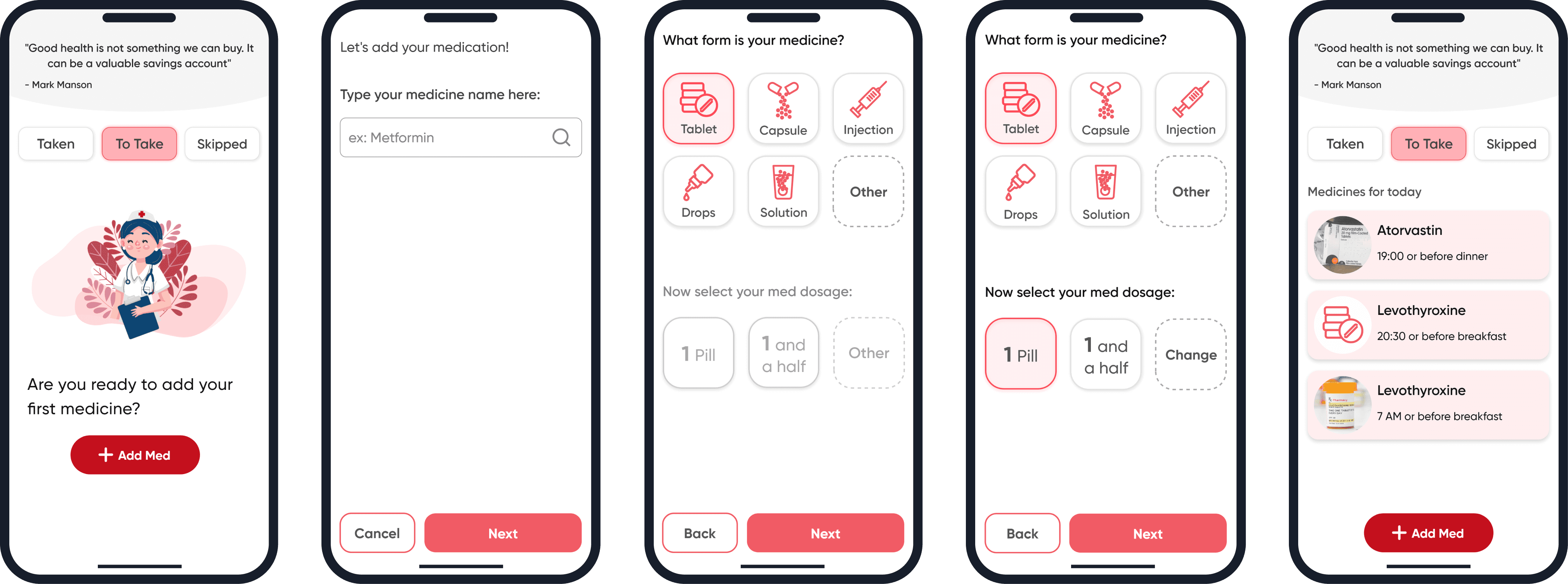
User Journey Map: We mapped the journey of a first-time user, dividing it into four key stages: Decision-Making, Onboarding, Adding a Medication, and Returning to the App. By anticipating their interactions, we highlighted pain points and opportunities to delight.
Essential Features
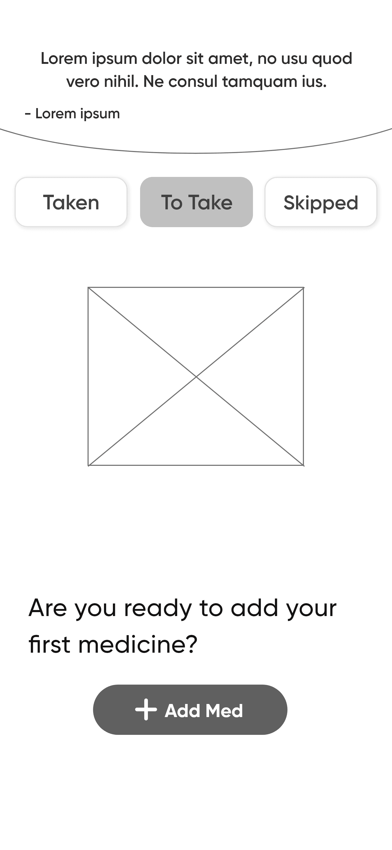
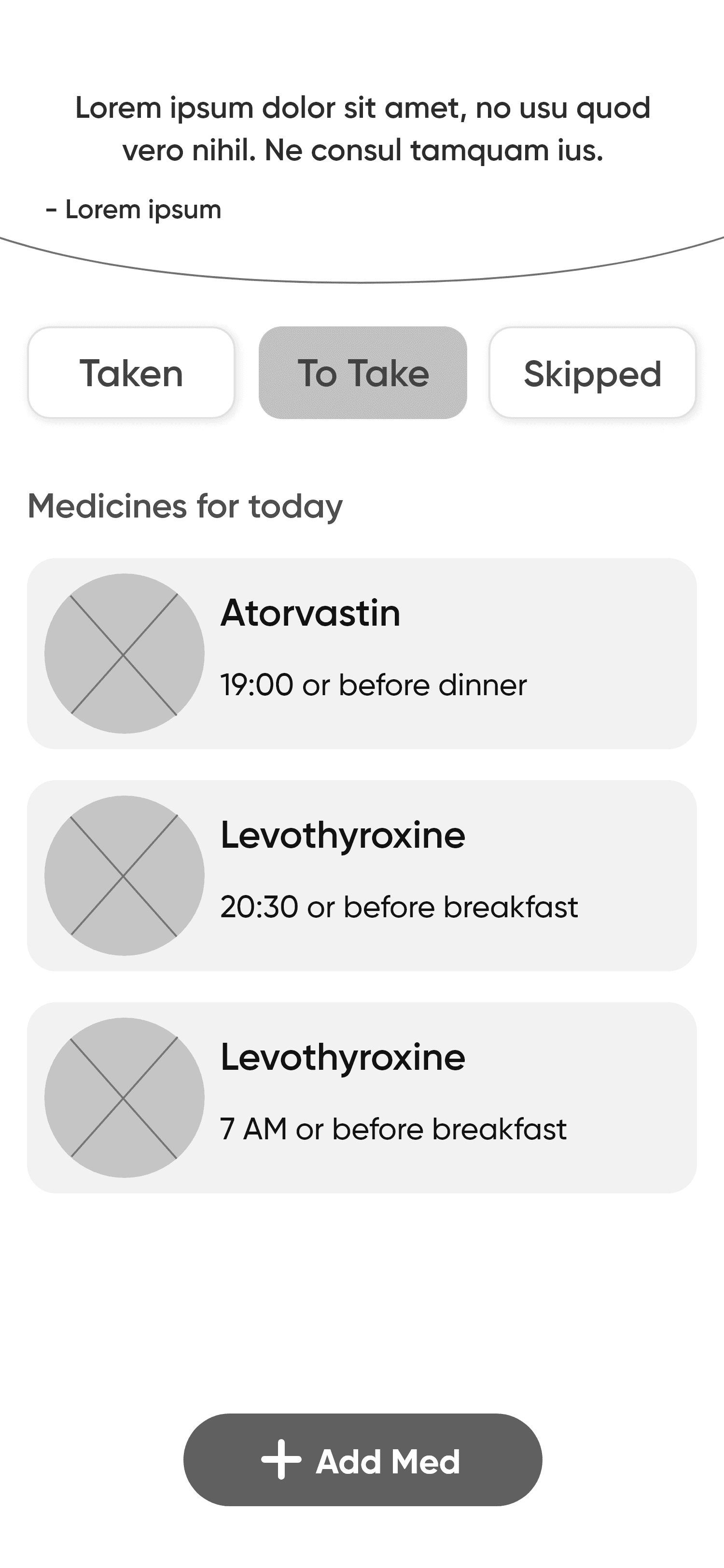
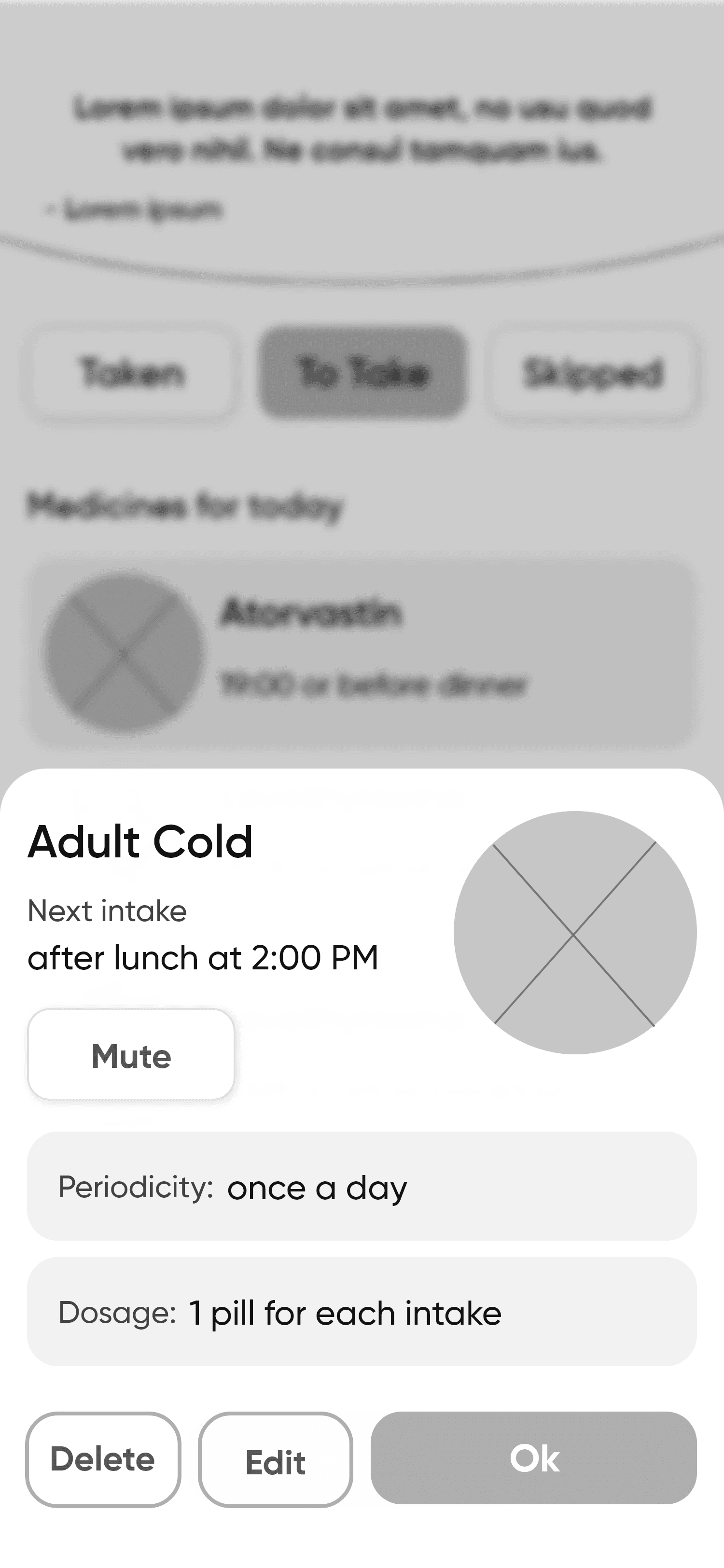
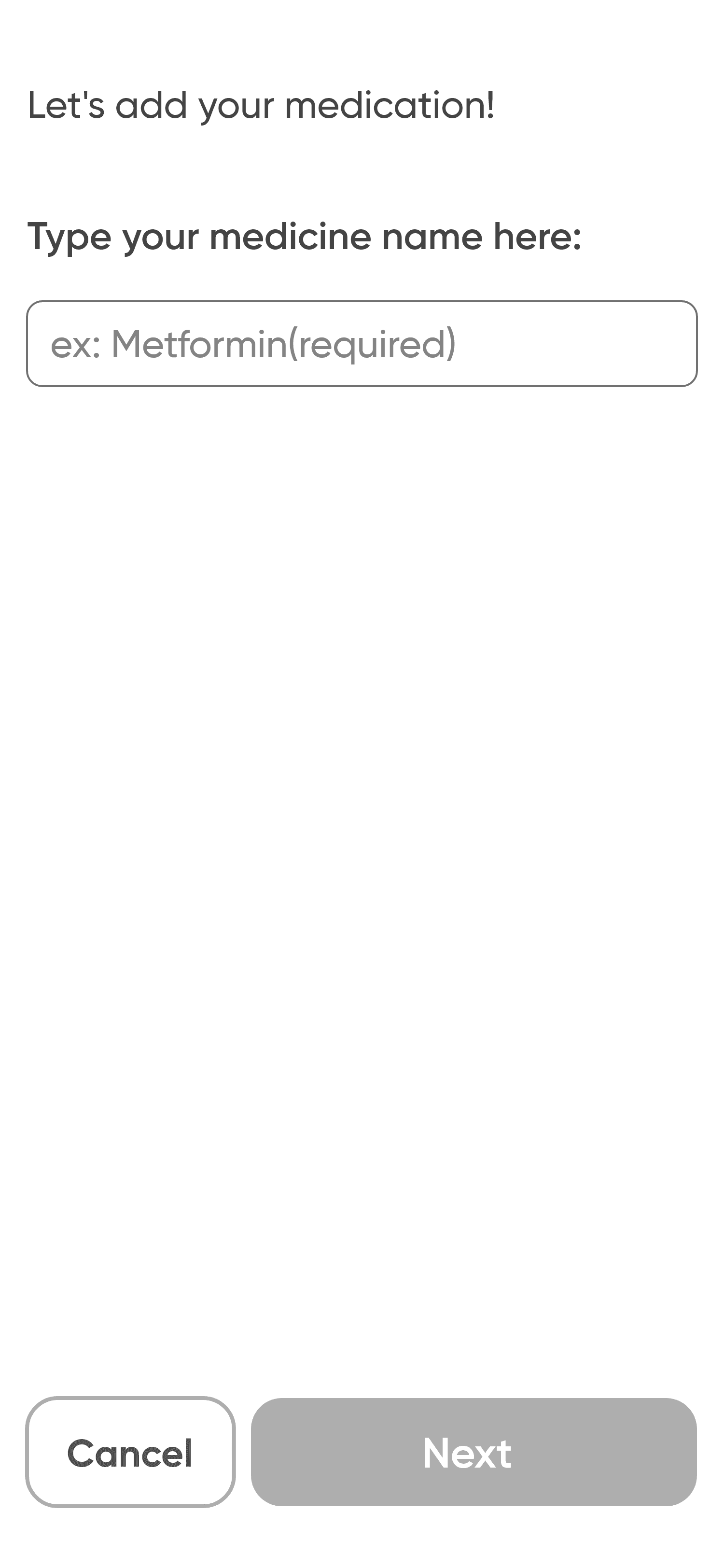
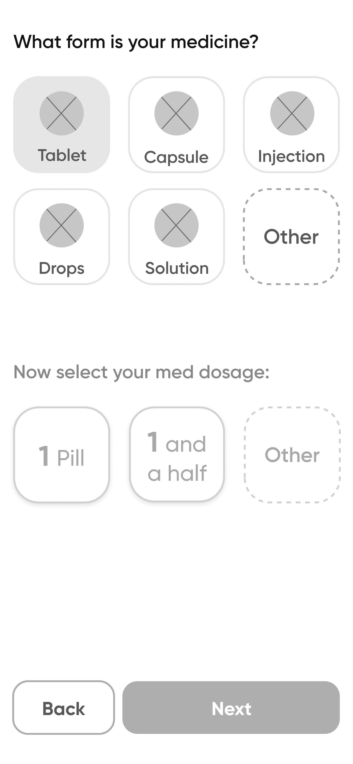
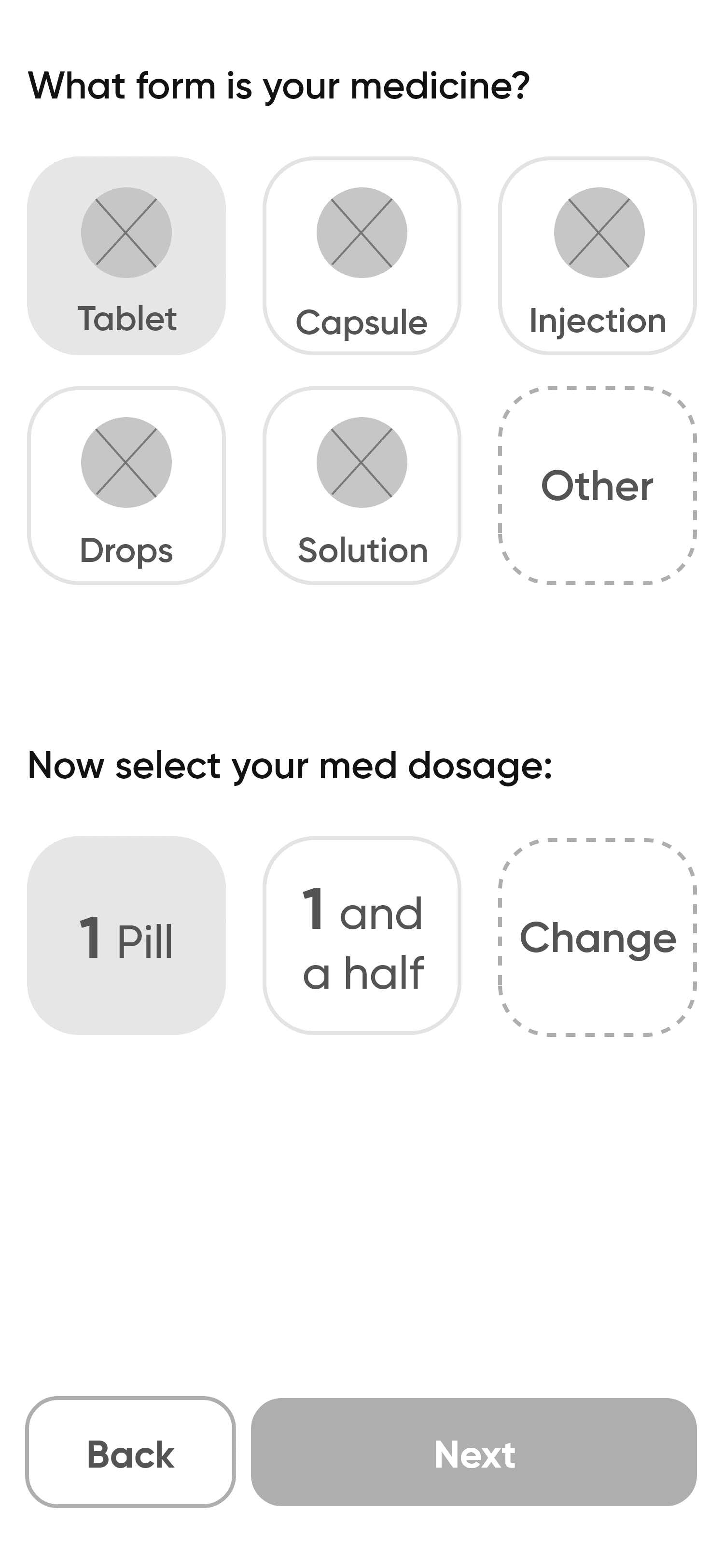
· A multi-step process for adding medications, reducing cognitive load.
· A "time with meals" feature for setting reminders.
· Clear feedback messages for errors, warnings, and successes.
· Extra-large UI elements for better readability.
· An intuitive, ever-present back button to ease navigation.
03/
How Did We Bring the Ideas to Life?
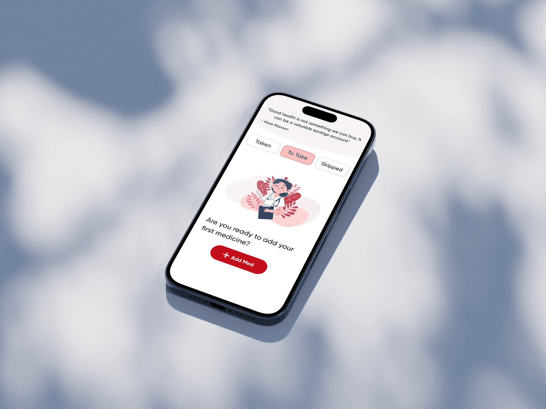
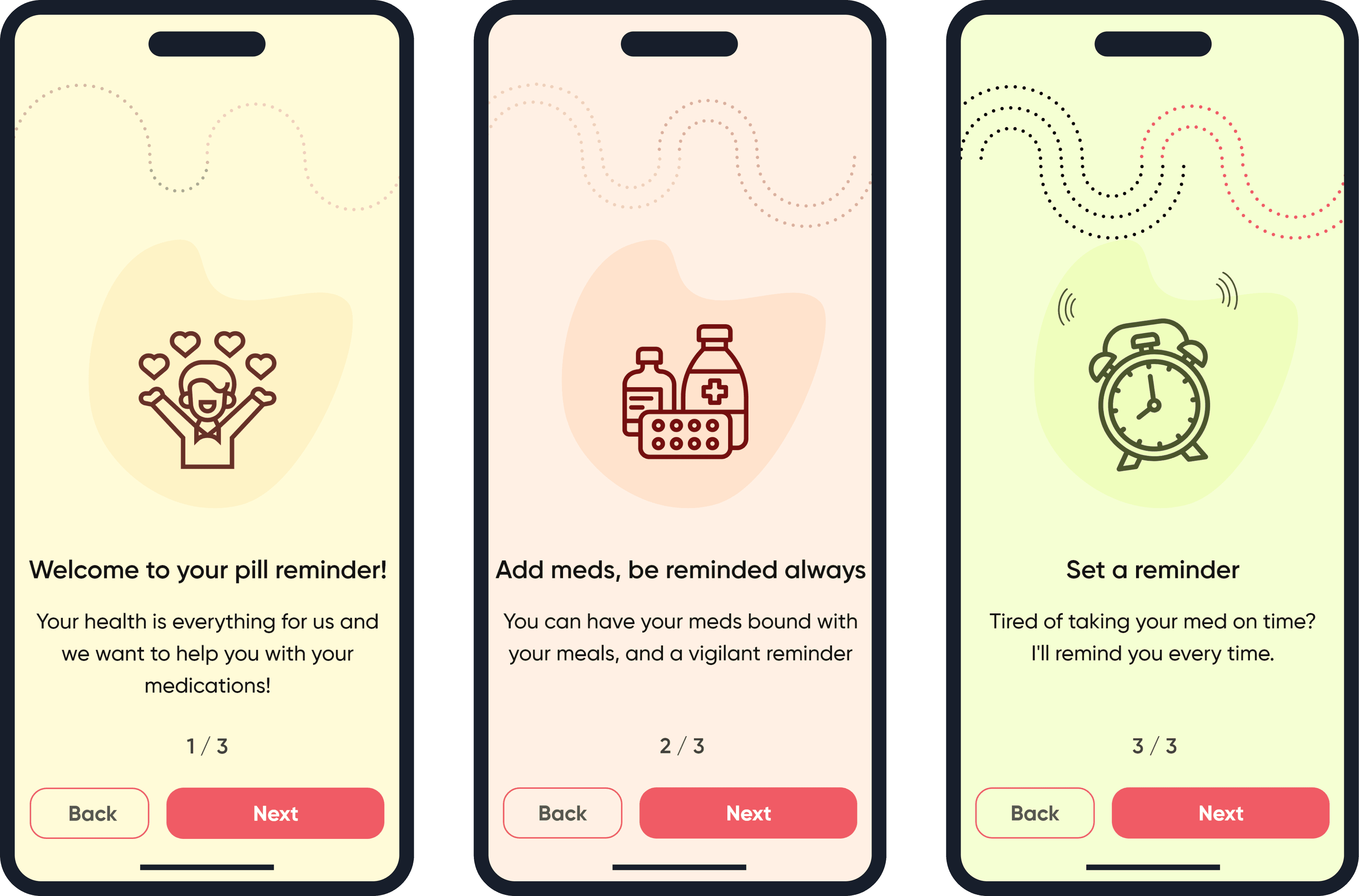
For the Prototypes, we focused on simplicity. We designed large, easy-to-read buttons and clear navigation to ensure seniors could move through the app without getting lost. Every page was carefully checked against WCAG (Web Content Accessibility Guidelines) to ensure we met the accessibility standards. This included making sure text had high contrast, buttons were large enough to tap, and everything was easy to navigate.
These UIs were designed to be simple and easy for seniors to use, with big buttons, clear colors, and helpful pictures, focusing on usability instead of modern looks.
03/
How Did Real Seniors Interact with the App?
We tested the app with 5 seniors and identified two key challenges. First, many struggled with long and difficult medication names. Second, seniors often rely on the appearance of their pills to remember when to take them.
To address these, we added a photo-taking feature that allows users to simply snap a picture of their pills, making it easier for them to input medication details and match them with the reminder.

A Tool That Truly Helps
After launching the pill reminder app, it was downloaded over 1,000 times within the first few months. This was a significant milestone for Living Maples, marking the release of their first product dedicated specifically to seniors.
Effective Remote Collaboration
Despite different time zones, I ensured smooth teamwork through daily sessions and detailed documentation for every step of the design.
Empathy in Design
I learned to view problems holistically—what’s simple for us can be challenging for seniors.
The Power of Simplicity
Simplifying design meant breaking down complex pages into smaller, easier-to-navigate sections for a better user experience.
A Scalable Design System
The Design System That Unified 20+ Projects into a Seamless Solution